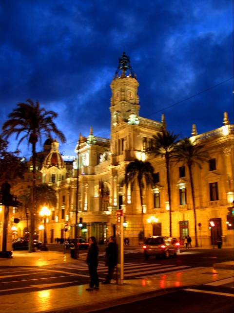
Ayuntamiento
There's a lot I like about this photo, not least the colour, which I haven't adjusted. I also like the basic composition.
However, the slow speed with inadequate support has made it a bit blurry with lots of squiggly lines. Also, I know it doesn't appear straight but I can't work out what to do - the clock tower leans slightly to the right, but if I correct that, it just worsens the right hand end of the building which is already leaning precariously to the left.